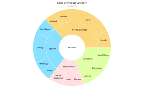
Pie and Doughnut Charts
The pie chart comprises of a circle that is divided into sectors, each representing a proportion of the summation of all values in a dataset. The chart is useful in depicting the share of constituents as part of the whole. The magnitude of the dependent variable is proportional to the length of the arc on the circumference of the graph. Radial lines are used to connect the arcs to the center of the circle, thus dividing the pie into slices.
A variation of the pie chart, the doughnut chart has a blank space at the center to show useful information about the data being plotted. It is useful in depicting the share of constituents as part of a whole. It also enables users to highlight data points by slicing out doughnut slices.


